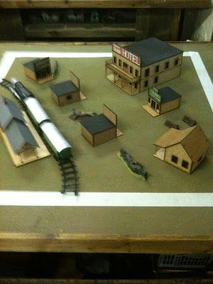
There's been some discussion on the Wyrd forums and elsewhere recently about how much terrain to use on a Malifaux board. I took snaps of the 8 tables used at the Masters last weekend and thought I'd share. To me these are a bit of a mixed bag - some definitely had too little terrain, and one in particular had perhaps a little too much, but as a general guide they're probably not too far off. Most of the terrain is from Maelstrom Games' collection, with the addition of the Sarissa Precision wild west buildings that had been kindly brought along by Dave 'Clousseau' Brown.
Once again forgive the photo quality. I'm yet to work out how to take a satisfactory picture on my iPhone - tips welcome!
Sunday, 22 January 2012
Subscribe to:
Post Comments (Atom)


2 comments:
This is a very interesting post given that the same topic came up on my own blog this week.
I think the last table is my favourite as it gives a good mix of large and small as regards terrain size and height. The tall building table seems ridiculous to me, not very practical to play on. The rest for the most part seems a little sparse with some wide open spaces, but we play with a lot of terrain to keep things up close and personal.
Having said that it was a tournament and, from my own experience with 40k tourneys, there always seems to be less terrain that you would normally like to see.
The tournaments that I have played in had less terrain, but I think that is because the people that set up the tables didn't really understand the game. I am a fan of tons of terrain! It adds another level of interest to the game.
Post a Comment